Robert Fisher and his Nirvana of a design archive
After graduating, Robert Fisher worked his way up to Geffen Records, taking the role of art director. Giacomo Lee discovers the story behind his Nevermind sleeve and what it was really like working with Kurt Cobain.
Note this article was originally published in the 38th and final issue of Long Live Vinyl, May 2020.
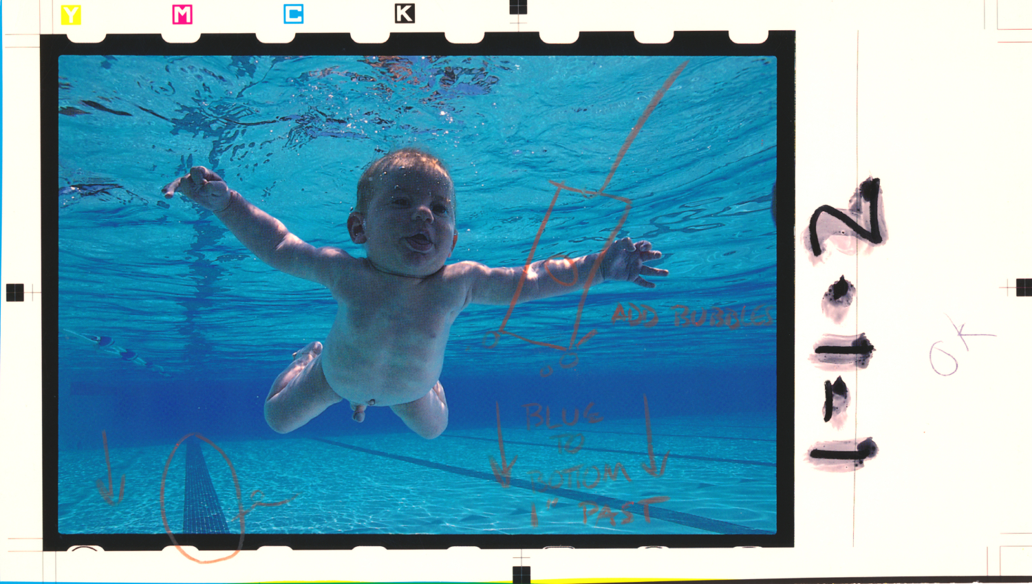
A baby and a buck submerged in water. The shaggiest of dogs caught in mid-air. An anatomy of an angel.
Iconic covers from some of the most famous albums of the 1990s, and Robert Fisher was behind all of them, each as ingrained in pop culture as the music itself.
But there's more where that came from, and Robert has recently opened up his archive with Instagram account Nirvana Bucket, giving Nirvana fans old and new a chance to pore over sights less seen.
"I was posting a mix of old and new work, and whenever I posted old Nirvana bits with stories behind the process it seemed there was a lot of interest from fans," Robert writes to me, referring to the Instagram profile for his design agency Flying Fish Studio.
"I began to realise I had a lot of Nirvana stuff saved and I didn't want it to take over my work feed. So I started Nirvana Bucket as a proper place to share and archive it all."
MEMORIA, MEMORIA
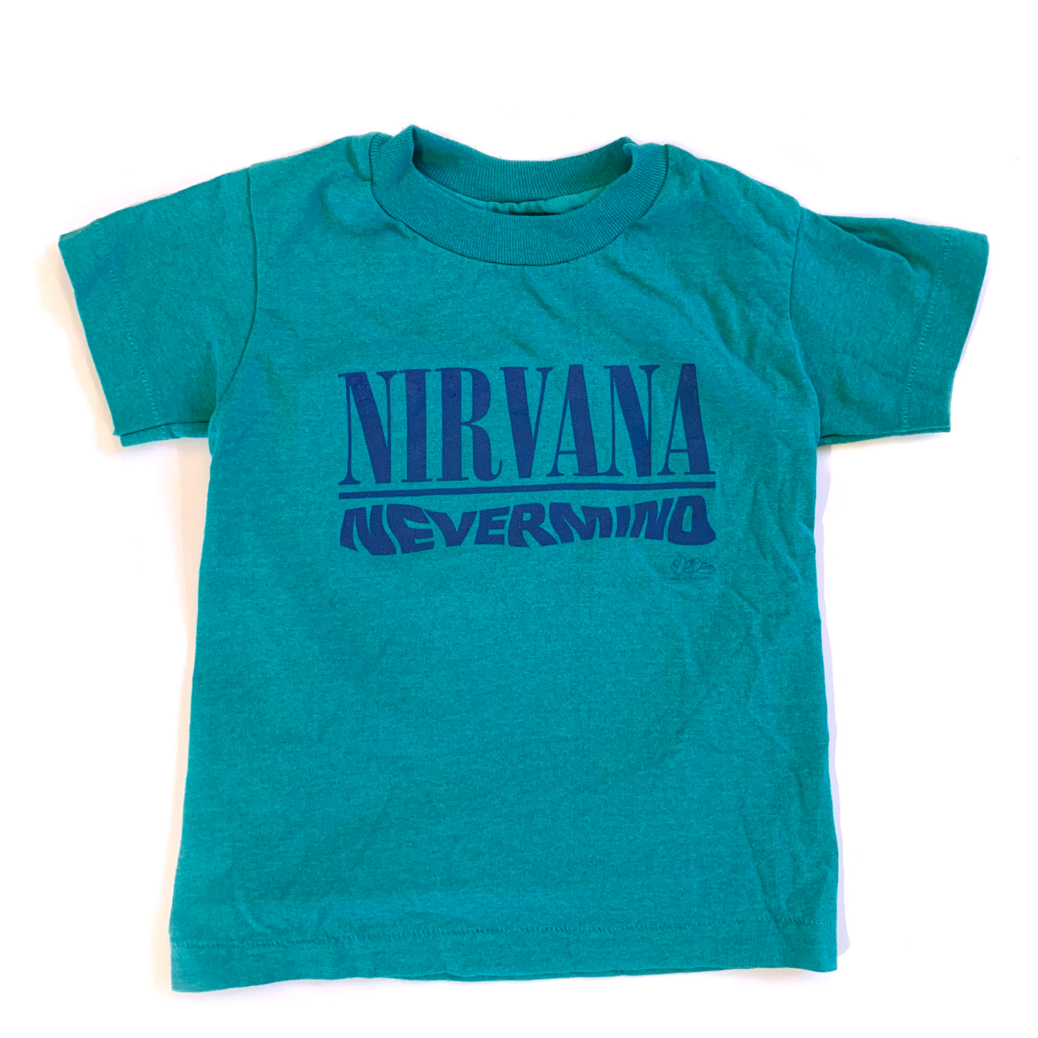
The account is a regular stream of unused sleeve mock-ups, promo material and various oddities (a toddler-sized Nevermind tee is one peculiar relic.) Robert links it all back to his childhood skateboarding around LA, dumpster diving behind record stores.
"I would always bring home cool promotional stuff and ephemera to hang on my walls," he explains. "I guess it always had some sort of special value to me as a kid and that probably was the start of my dream of working in the music industry."
"When I worked at Geffen I stored away every little promotional item and tons of stuff from all the things I worked on. I sometimes forget what an impact Nirvana had on the world and that there are kids out there like I was who are enthralled with the artwork and stories behind it. I guess I'm just paying it forward, one fan to another."
Robert studied at Otis College of Art and Design prior to working at Geffen Records; he was hired by the legendary label upon graduating in the late 80’s, creating during his time there visual identities not just for all of its Nirvana releases but also for bands like Urge Overkill, Swervedriver and Teenage Fanclub.
The role was a dream come true for the young designer, a lover of music and music artwork since childhood.
"I remember in maybe fourth grade my sister and I would save up our allowance and buy albums," he tells me. "We had this little stereo on a cart we'd share between our rooms, and I would sit in my beanbag chair with headphones on and just stare at album sleeves."
"The Beatles' White Album came with a poster that had so many little photos it was mesmerising. Later I was really into Led Zeppelin, Yes, Pink Floyd art. That's all really before I had a concept of graphic design or the people behind the designs."
"Later in art college," he continues, "I had a few teachers like Mick Haggerty and Tim Eames who worked in the music industry that I really looked up to."
"During my studies I was influenced by Neville Brody, David Carson, and Vaughn Oliver (R.I.P.) I would buy anything on 4AD just for the sleeve design."
NOODLES & DOODLES
Robert's history with Kurt Cobain saw the designer and musician talk all things art and design, but influences on the look of Nirvana sleeves stemmed more from Kurt's interests as opposed to any classic covers or visual creatives.
"We never really sat down to formulate a master plan for each release," as Robert explains. "I recently watched an old interview of Kurt talking about some of the music videos they did, and he mentioned that he liked to work with people that would not only get his vision but also bring their own ideas and surprise him with things he wasn't thinking of. He often gave me a lot of freedom to do whatever."
"With (1992 compilation) Incesticide for example, I showed up to my office after lunch one day and there was this large green painting in my office with a note that he wanted this to be the cover. That was it.
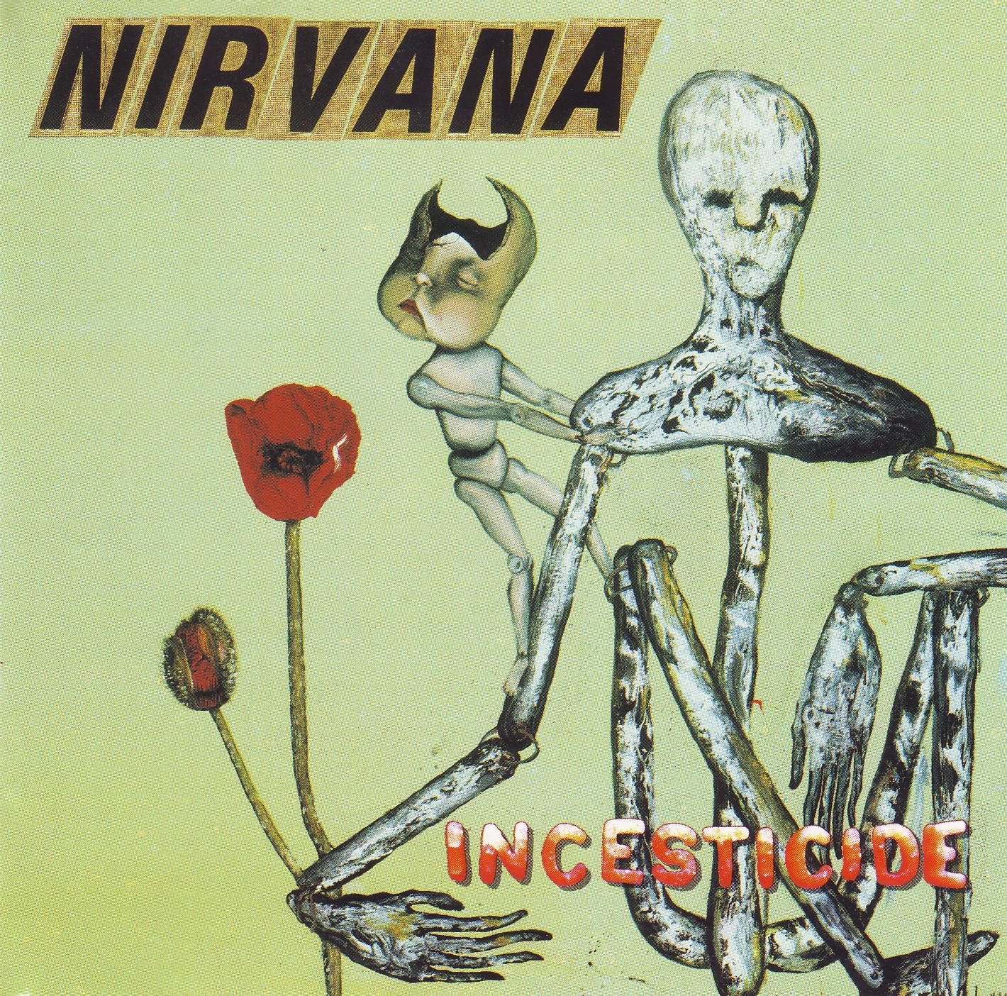
"I think I just sat with it for a few days to soak it in. I probably at first thought it was kind of ugly but after a while I started to appreciate it. It can be a bit stressful having to create something with another artist's work without really having any kind of discussion about it, and throw in the fact that it's for a band that's blowing up like Nirvana with millions of fans waiting for it. You have to let your subconscious aesthetic judgement lead the way or you could overthink it and freak out."
"I knew Incesticide wasn't gonna be slick and clean like Nevermind. I didn't even feel that the Nirvana logotype was right for it. Looking for other options, I went down to the hardware store and bought those letters for a mailbox. The shape of the main figure with long noodle-like arms and legs inspired me to buy a bag of alphabet noodles for the type and song titles."
While Kurt allowed Fisher the greatest of creative freedoms when it came to art direction, actual art in itself was more precious for Cobain.
"I once had a friend do an illustration for a postcard for their first time on SNL," Fisher says, harking back again to 1992. "It came out cool, and everyone was happy, but I do remember later hearing Kurt didn't like illustrations for their art unless he did them. Makes total sense, though.”
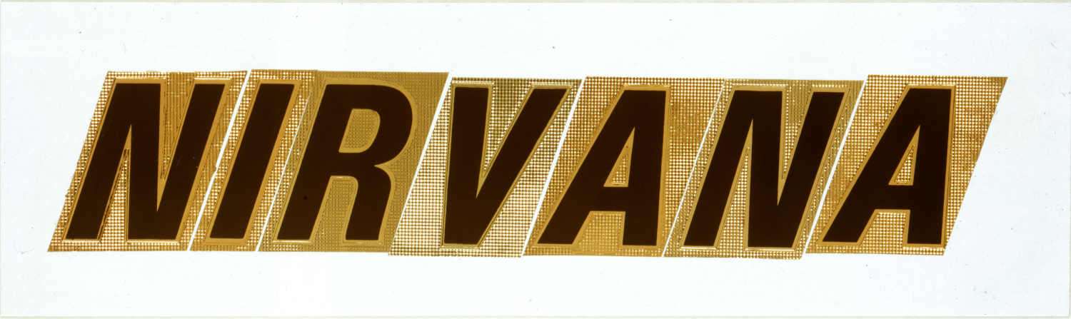
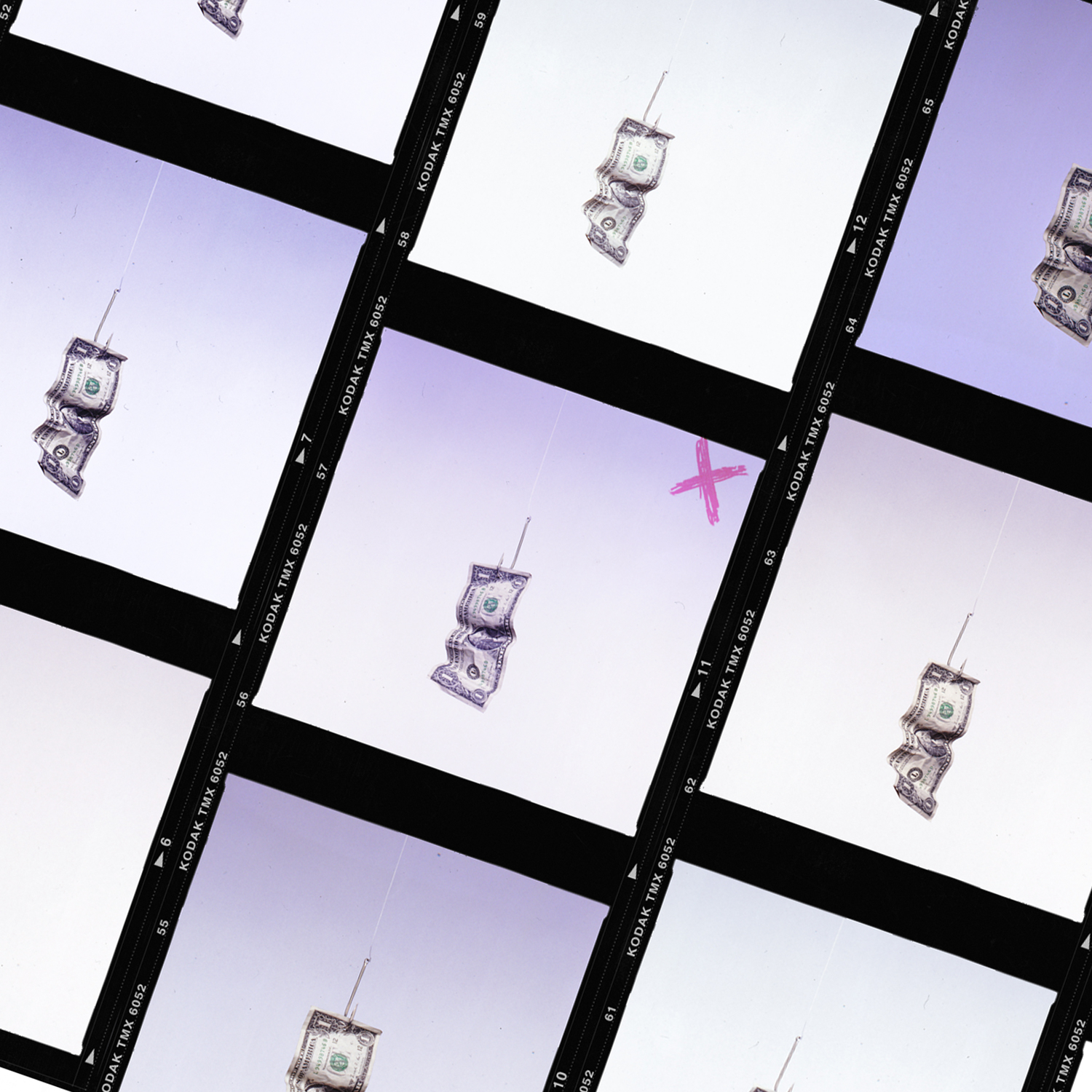
That said, Cobain was happy with Robert’s creations, Nirvana’s smiley logo being one example. Fisher originally drew a few versions of it, including one with dollar signs for eyes; the sickly face we all known today began its life on a promo shirt sent out to radio stations. That trust in Robert has carried across all of the band's releases since, including Kurt-focused compilations like 2015's Montage of Heck.
It's even included albums that never saw the light of day.
VERSE CHORUS VERSE
During his trawl through the archives for Nirvana Bucket, Robert was surprised to find a printout of work he started for Verse Chorus Verse, a double album that was to contain the acclaimed MTV Unplugged performance on one disc and a mix of live songs on the other.
"After Kurt's passing it eventually got scrapped and just Unplugged was released," he recalls. "There has been so much mystery online about Verse Chorus Verse and what and where the original songs were from. I had some fans reach out and ask if I ever started working on it and I totally forgot I did."
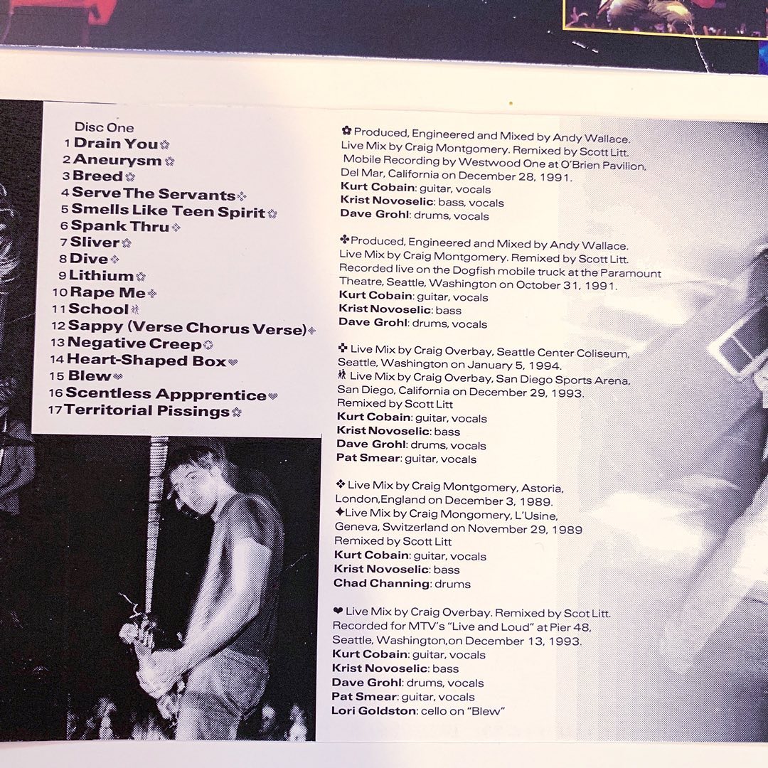
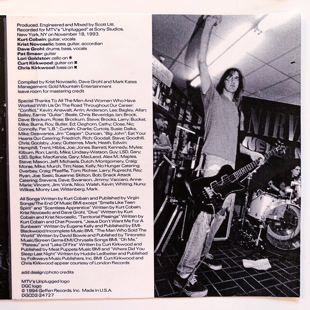
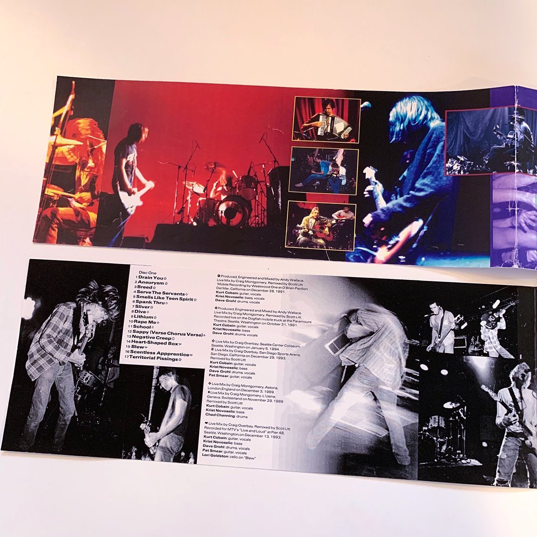
"Then one day I found this old printout taped together of the beginnings of the design for it and I was like, 'Holy crap.' It had all the original copy and info on the songs so people could finally see what they were going to be."
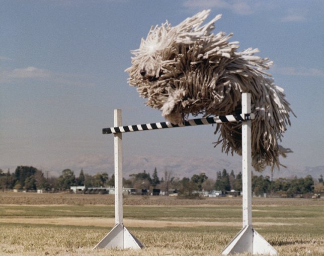
Verse Chorus Verse would eventually become From The Muddy Banks of The Whiskah, a collection of totally different live recordings released in 1996. That was the same year Robert found himself aligned with another groundbreaking Geffen record in the form of Odelay, the Beck masterpiece that saw Hansen vault into the mainstream much like the cover’s jumping dog.
"Beck was a bit more involved with his artwork (than Kurt), especially as his career progressed. His grandfather was an experimental artist so he came from that world and had more of an opinion."
"He would come over to my house and we'd sit at the computer and make digital collages and work on the insides. He would let me throw in my ideas as well."
The swerve in 1990s alternative from the raw honesty of Cobain to Hansen’s cryptic cool might be seen as a radical change in music trends, and Robert's work in the years since for the likes of No Doubt and Weezer perhaps reflects a bolder demand for colour and personalities rather than artistic works and statements.
But the biggest transformation Robert has felt over his three decades in the business relates more to consumption than branding.
"I love how now you can get almost any song or album immediately. But in a way that almost cheapens it when compared to hunting down an album at a store and having that tactile LP or CD in your collection.
"I love that vinyl is making such a comeback and I'm glad I hung on to all my albums over the years. I think it's the artwork that wouldn't let me part with them. They are a bit of a ball and chain every time you move, but pull out a mint condition 70's Zeppelin bootleg with beautiful sleeve design and it's all worth it to me."
No doubt many feel the same when pulling out a Robert Fisher classic from their collection.
Robert Fisher on eight of his classic covers
Nirvana: Nevermind, 1991
In another universe, this cover would have been of a baby being born underwater as Kurt originally envisioned. In this universe, the cover has seen countless parodies and homages.
"The Rolling Stones Simpsons one was cool; I was always a big fan of the Simpsons, " says Robert when listing his favourite reworkings. "There was also that recent one where some artist did a statement on the polluting of our oceans and put a bunch of trash mixed in with baby Spencer. I thought that was well done."
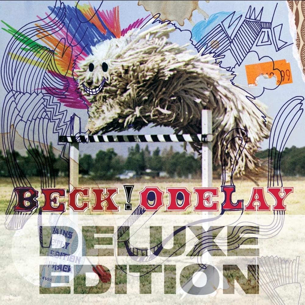
Beck: Odelay, 1996
Beck himself chose the unforgettable cover shot of a shaggy Komondor leaping over a hurdle, but the artwork would have less of an impact without Robert’s art direction, from the type on the cover to the masterful art collage of the package as a whole.
In a twist of fate, the action shot used was taken in the 1970s by a photographer, who, at the time Fisher needed clearance for the image (below), was based only a few blocks away from the Geffen offices, as revealed in the podcast Undercovers.
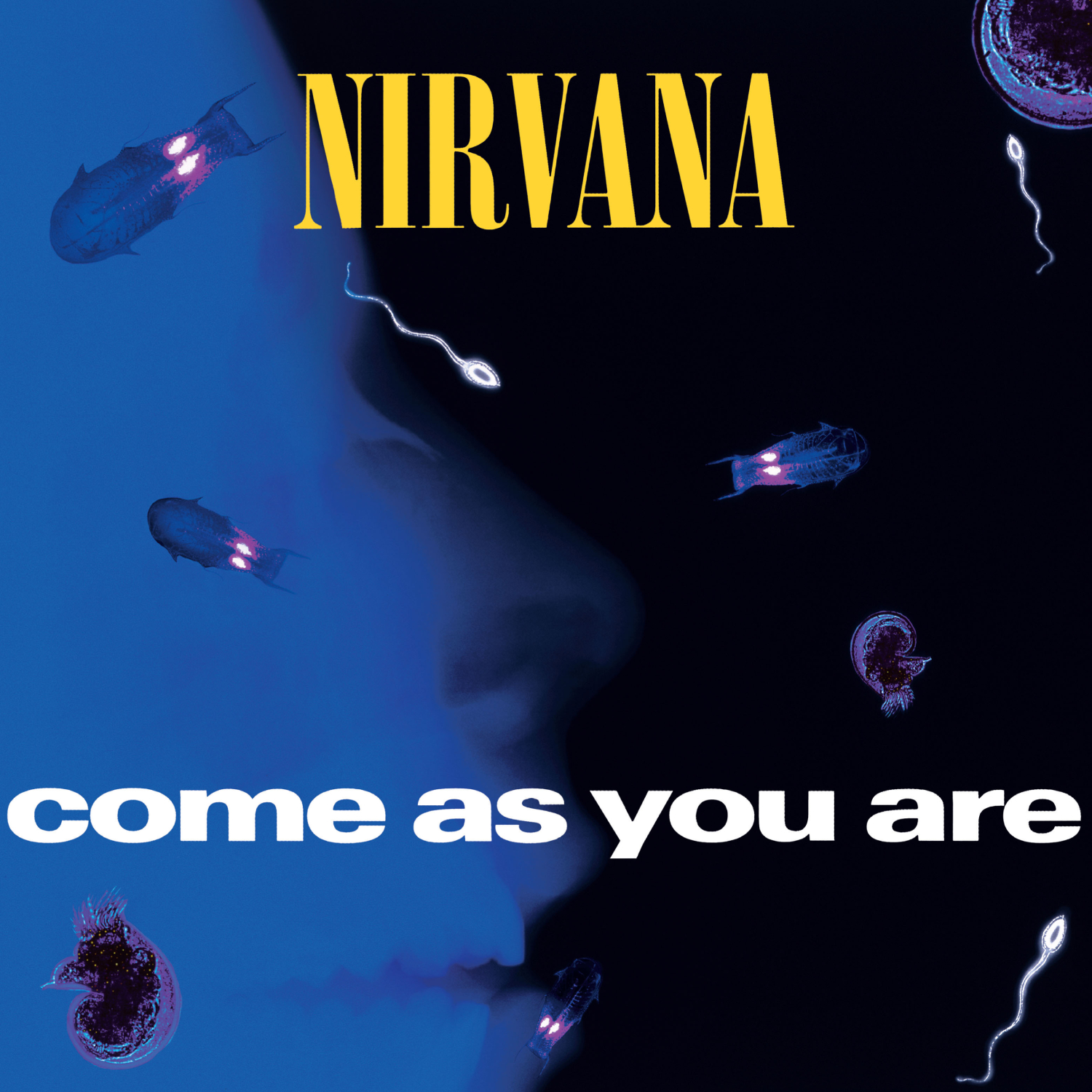
Nirvana: Come As You Are, 1992
“All Kurt said was he liked microscopic organisms and the colour purple,” explains Robert. “I just ran with it from there.”
The x-ray you see in the cover is actually of Robert when he broke his nose in middle school. The image also graced a song book for the song which Fisher’s proudly posted to Nirvana Bucket.
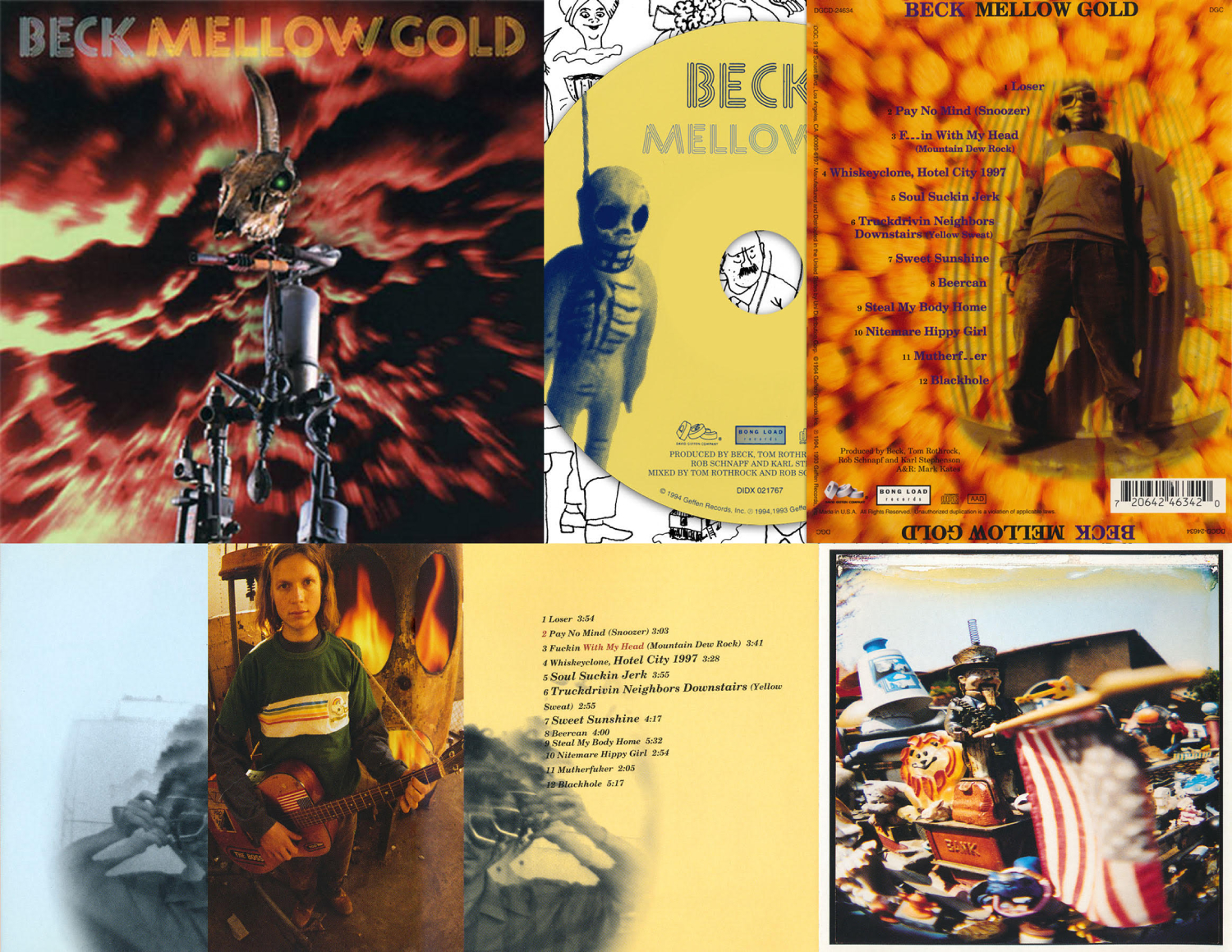
Beck: Mellow Gold, 1994
Beck's first album to successfully hybridise his noise freak roots with Gen-X college rock features an aptly bric-a-brac cover. The bizarro sculpture at its gnarly centre was made by Eddie Lopez, a member of Beck’s commune-like artist circle at the time. Photographer Ross Harris shot the artwork in Lopez's garage before a more apocalyptic background was swapped in, as befitting the sculpture's name of 'Survivor from the Nuclear Bomb'.
“The figure on the disc was a close-up of a little Day of the Dead figure I had in my office. For the back inlay I bought a big jar of cheese ball snacks. Ross Harris, Beck's friend who was also in the band Sukia, is the guy with the goggles I 'split' in half.”
Nirvana, Incesticide, 1996
“The duck on the back came about because I had these macro extension rings for an old 33mm camera and I was into shooting stuff close up,” Robert reveals.
“I had a collection of toys and figures in my office, one of which was a duck. I think the bright yellow orange was in such contrast to the sickly green on the front that it was interesting to me. I put it all together and sent it off for approval. It was approved first go. That could have gone either way but Kurt liked it. So I guess our tastes were aligned and I got to keep on working with them.”
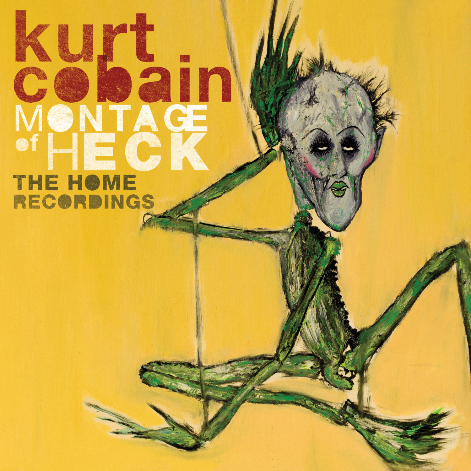
Kurt Cobain: Montage of Heck: The Home Recordings, 2015
“For this I mainly worked with Vartan Kurjian over at UME. The main cover was already done from the film’s one sheet so it was mostly putting together all the inside stuff and special little features.
“We did a cassette for that and that was a flashback. I hadn’t designed a cassette in a very long time.”
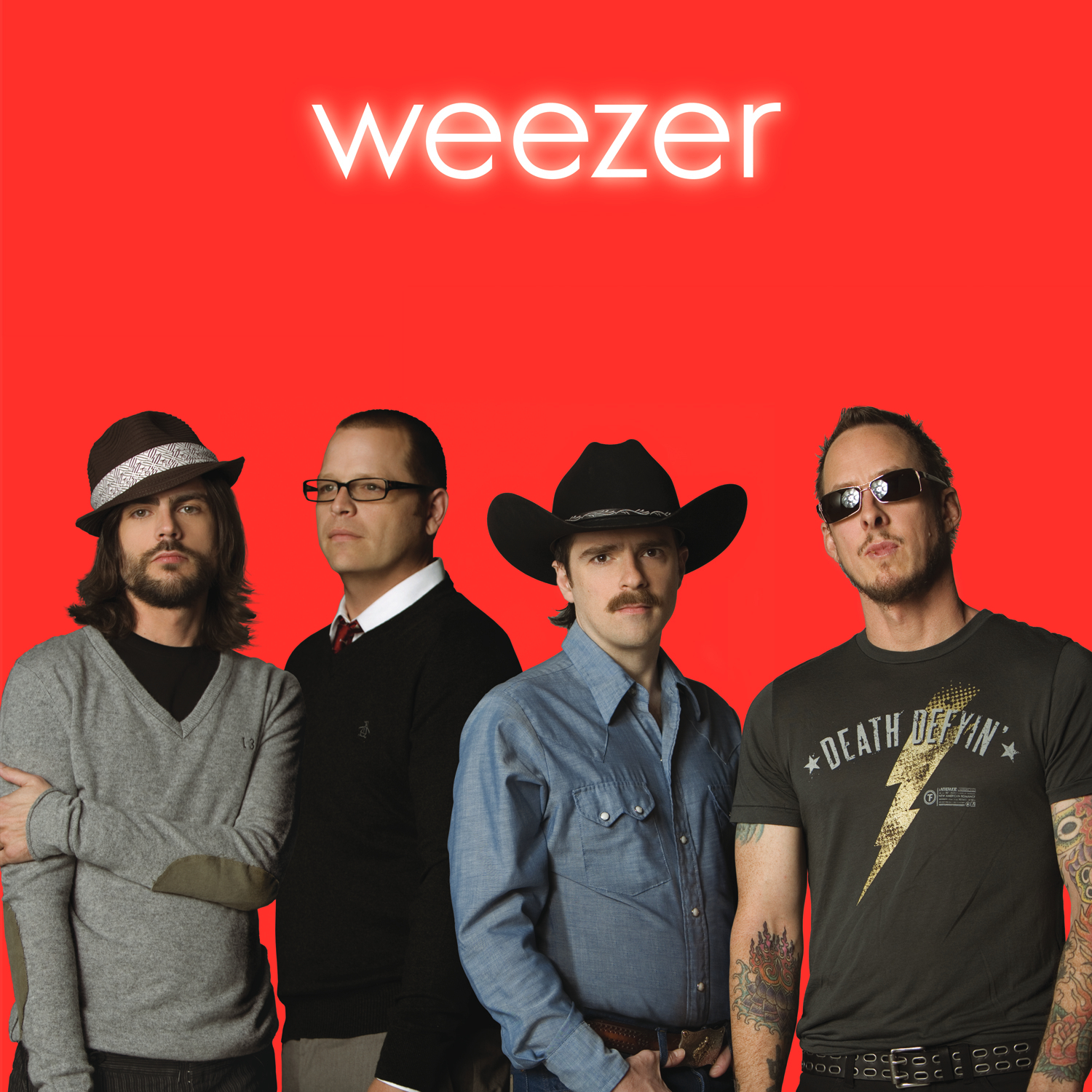
Weezer: Weezer (Red Album), 2008
The third of Weezer’s self-titled ‘colour trilogy’ came from Fisher having fun with the band during three days of photo shoots.
Robert placed in a red background after as the album’s original title of The Pure Sounds of Weezer was jettisoned by the band, who liked how the image reflected the album’s gestation as more of a group effort than other LPs.
Nirvana: In Utero, 1993
There’s more than one version out there of this album’s artwork, including a ‘dark mode’ spin by Fisher made for the album’s 20th anniversary re-release.
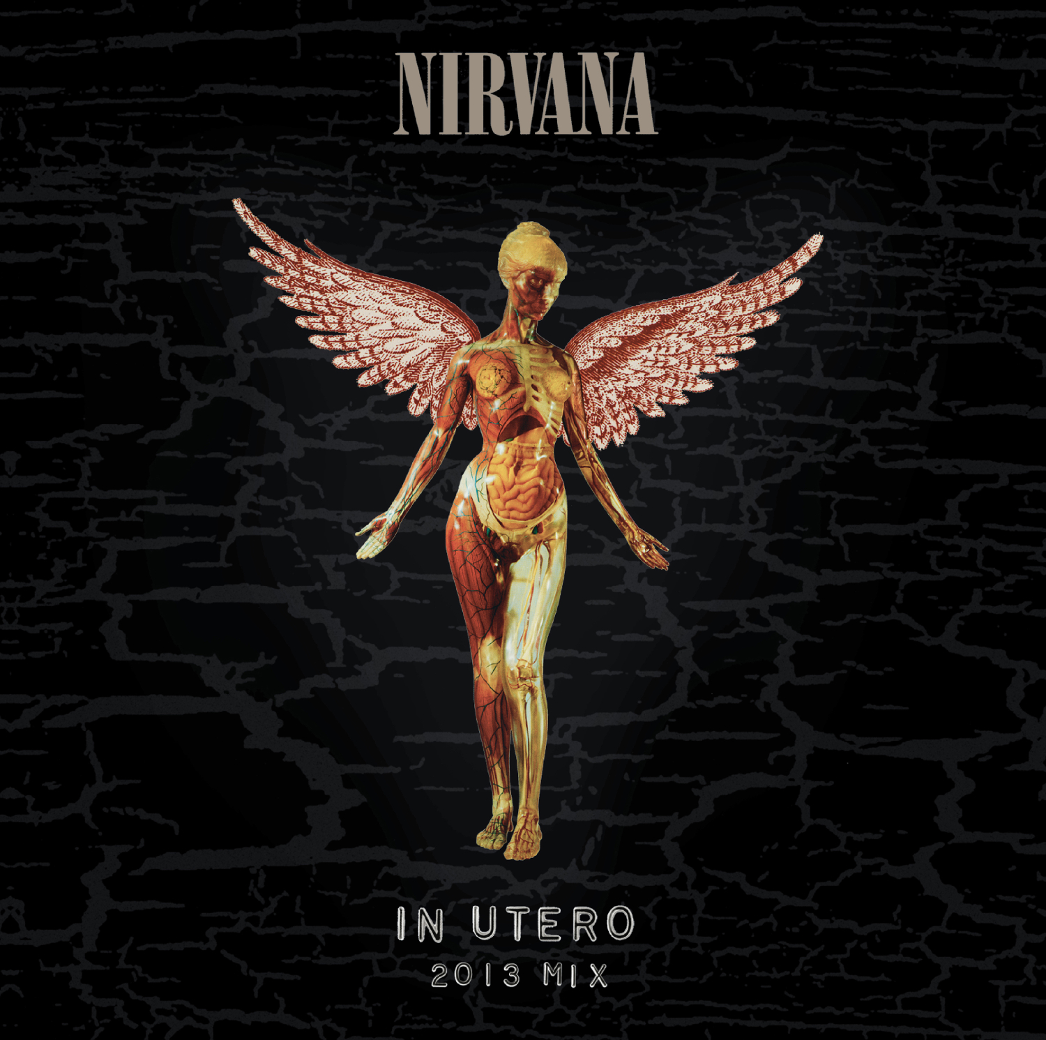
On its release, several American retailers took offence to the foetus collage on the album’s back cover, refusing to stock it as a result. Fisher was henceforth asked to crop out the offending figures, but only for the Walmart and Kmart CD editions.
Follow Robert Fisher @nirvanabucket.
My rundown of Beck's 10 best album covers can be found here.

0 Comments Add a Comment?